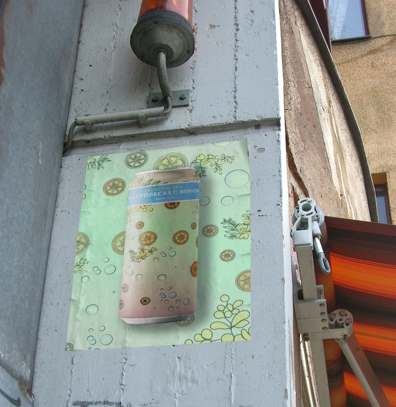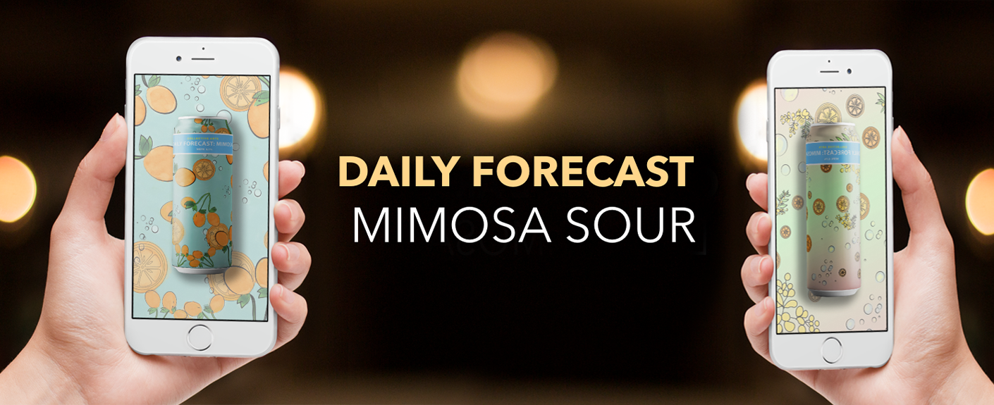
I developed a beer can label for a craft brewery, designing visuals that authentically capture the flavour and experience of the beverage. Inspired by the zesty, citrus notes of a classic mimosa, the design reflects its bright, refreshing essence while embracing the hazy character of the brew. My goal was to create a bold yet sophisticated illustrative design that conveys freshness, effervescence, and a brunch-time allure, all while preserving the brand’s artisanal and handcrafted identity.
Design Concept & Approach |
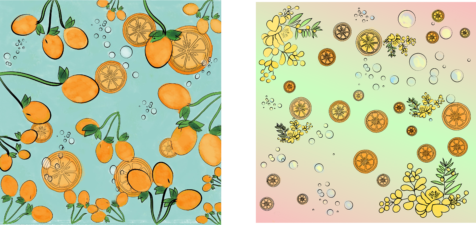
⚬ Vibrant citrus-themed illustrations highlight the mimosa-inspired flavours.
⚬ Hand-drawn elements for a crafted, artisanal feel that aligns with the brewery’s identity.
⚬ Effervescent bubbles and gradient backgrounds mimic the light, refreshing nature of mimosas.
⚬ Balanced composition ensuring a visually engaging yet structured layout for brand consistency.
Key Deliverables |
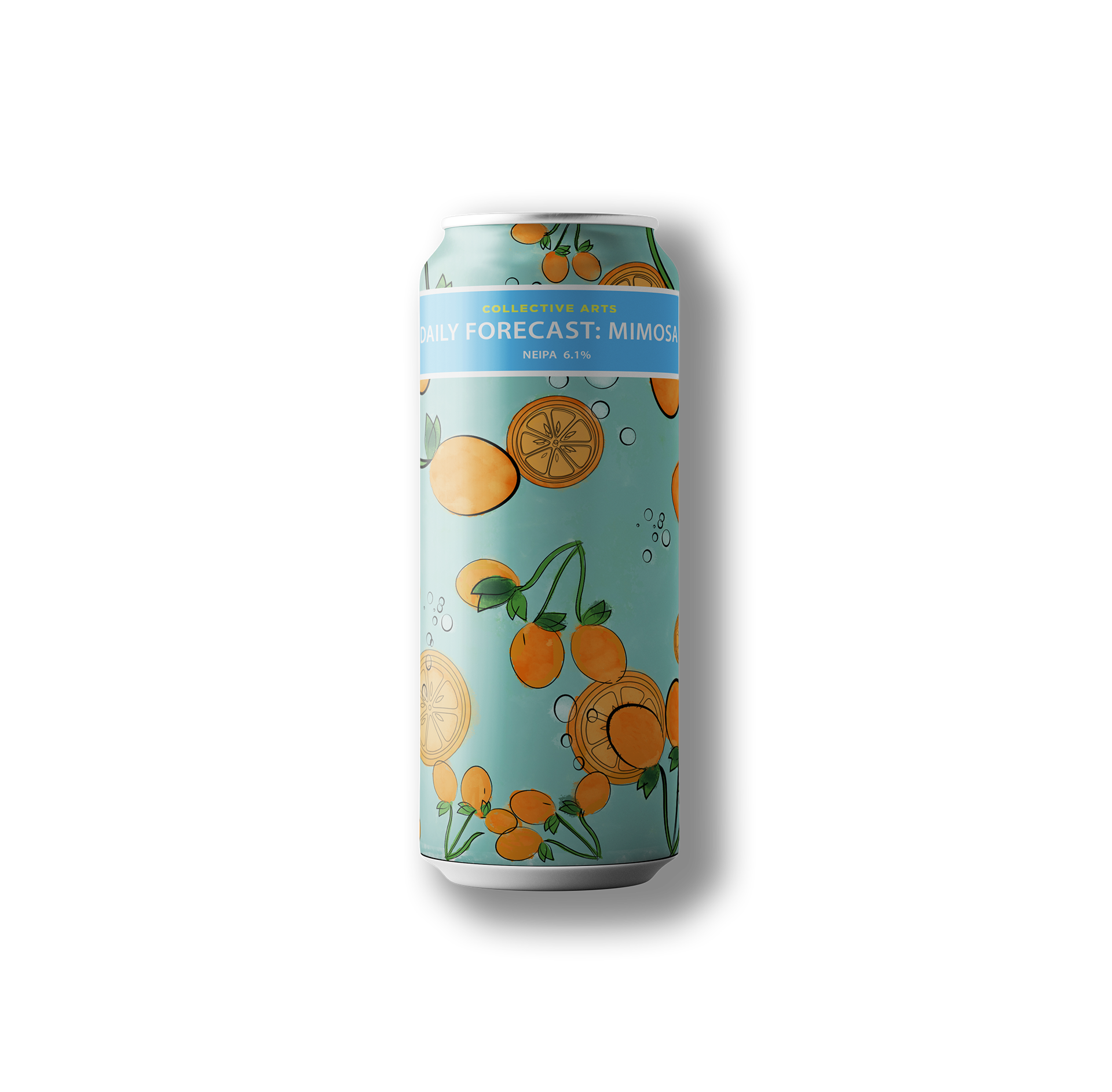
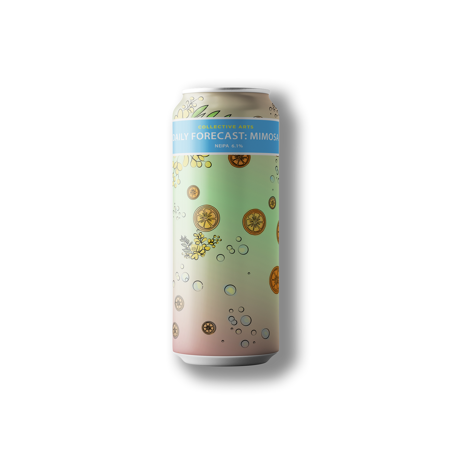
✓ Logo & Branding – Two distinct label variations featuring citrus fruits, and floral accents.
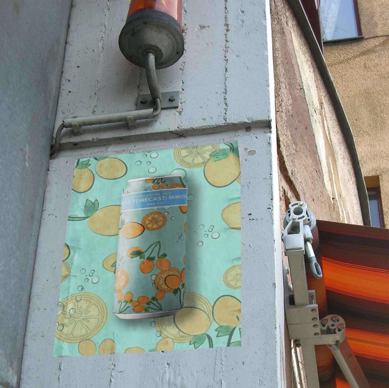
✓ Packaging Design – A seamless wrap-around design that enhances shelf appeal from every angle.
✓ Business Merchandise – Maintains the brewery’s craft beer artistry while emphasizing the unique inspiration.
✓ Sustainability – The design complements their eco-conscious mission by aligning with sustainable packaging.
⚬ Encourages upcycling of cans with visually appealing artwork to be repurposed or collected.
✓ Logo & Branding – Two distinct label variations featuring citrus fruits, and floral accents.
✓ Packaging Design – A seamless wrap-around design that enhances shelf appeal from every angle.
✓ Business Merchandise – Maintains the brewery’s craft beer artistry while emphasizing the unique inspiration.
✓ Sustainability – The design complements their eco-conscious mission by aligning with sustainable packaging.
⚬ Encourages upcycling of cans with visually appealing artwork to be repurposed or collected.
The Impact | The design effectively captures the fresh, effervescent essence of the beverage while reinforcing the brewery’s artisanal and eco-conscious identity. The vibrant yet balanced visuals enhance brand recognition and shelf presence, making the product instantly appealing to craft beer enthusiasts and casual drinkers alike. By incorporating hand-illustrated elements and sustainable design choices, the packaging not only serves as a functional label but also as a collectible, encouraging reuse and brand loyalty.